How to Create a High Converting Landing Page That Turns Traffic into Money


High converting landing pages are standalone pages that meet your audience’s needs, build trust, and drive a desired action.
A landing page isn’t just another webpage. Done right, it’s a powerful tool that turns qualified traffic into money. But how do you create a high converting landing page that doesn’t just look good, it also works?
We break this down into actionable steps, backed up by examples so that you can start selling more.
What Is a High Converting Landing Page?
A landing page is a standalone webpage with one clear goal: get visitors to take a specific action.
Think of it as your digital elevator pitch. Visitors will “land” on the page after clicking a Google ad or a link in your marketing email (still one of the most effective channels to convert visitors). You then use compelling copy, engaging visuals, social proof and a strong call-to-action (CTA) to drive an action — like signing up for a newsletter, registering for an account, downloading a guide or making a purchase.
When done well, you’ll have a high converting landing page that maximises the number of visitors who take the desired action. Having a high conversion rate means more leads, more sales and more ROI from the traffic you’re already paying for.
But what’s a good conversion rate to strive for? Across industries, the average landing page conversion rate sits at 6.6%. If you’re hitting below that mark, there are steps you can take to increase your conversion rate.
Most of the websites that we are sent to review or work on have a conversion rate of on average 1%. But if we obey the best practices when we build a website or a landing page, that conversion rate might be 10%.
 Tim Cameron-Kitchen
Founder
Tim Cameron-Kitchen
Founder
How to Optimise a Landing Page for Conversion
Choose One Goal
Your landing page should focus on a single action. Are you collecting leads? Booking consultations? Selling a product? Decide what single action you want visitors to do and make it obvious.
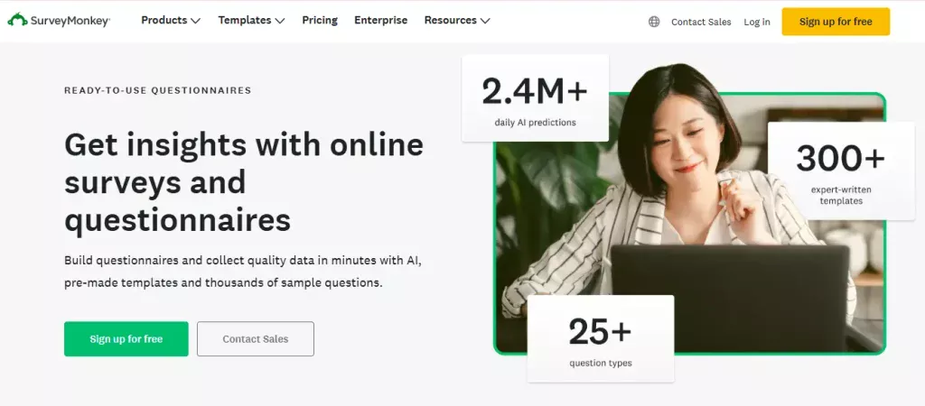
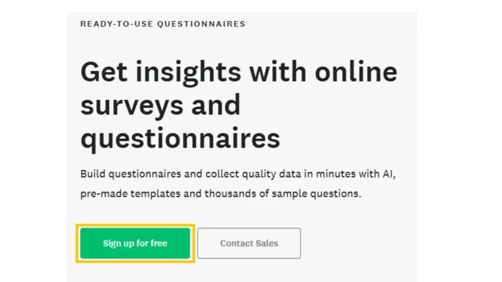
Take SurveyMonkey‘s landing page. Everything on this page — from the headline to the CTAs — is designed with one clear goal: to get visitors to sign up for their questionnaire and survey builder.
Deliver Your Ad’s Promise
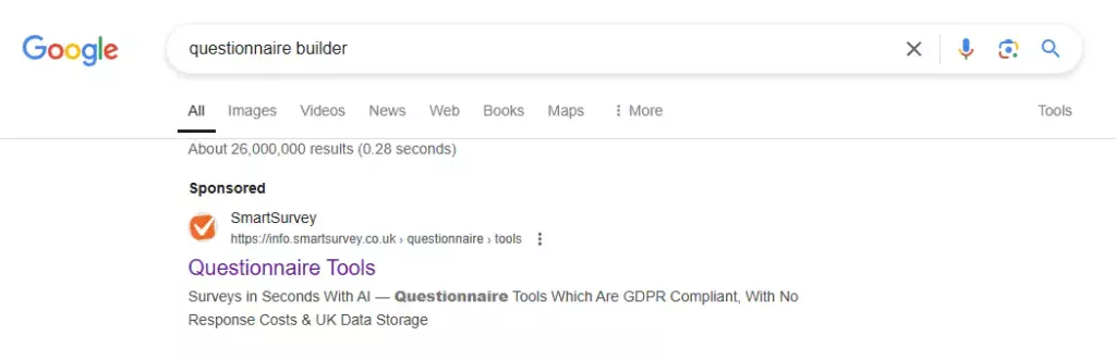
Your ad makes a promise, and your landing page’s job is to keep it. If your ad says, “Get a Free Guide”, your landing page should deliver the free guide. Consistency between your ad and landing page builds trust, encouraging conversions instead of bounces.
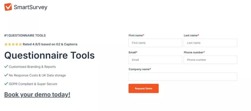
Look at SmartSurvey’s ad and landing page. Their ad promises a lightning-fast, GDPR-compliant questionnaire tool, and their landing page picks up right where the ad leaves off.
Present a Focused CTA
Your CTA button is how you turn visitors into leads or customers. To make it work, your CTA needs to be unmissable and use direct language that tells users exactly what to do.
Don’t settle for generic, vague phrases like “Submit” or “Get Started”. Instead, go for specific, action-driven copy like “Start Your Free Trial Today” or “Download Your Free Guide“. This clarity reduces hesitation and reinforces the value of taking that step.
Sometimes, having a secondary CTA can help, especially for visitors who aren’t ready to take the main action. Your secondary option should support — not compete with — your primary goal.
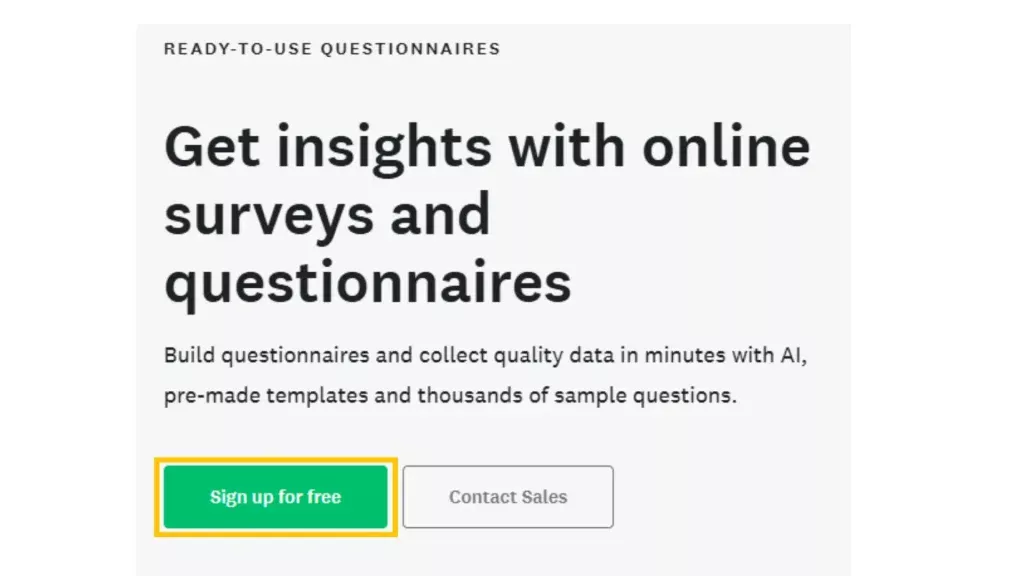
SurveyMonkey nails this by pairing their bold primary CTA, “Sign up for free”, with a softer secondary option: “Contact Sales”. The primary CTA is designed to grab ready-to-go users, while the secondary option captures leads who need more information before committing.
Use a Simple and Intuitive Design
A simple, intuitive landing page doesn’t just look good — it builds trust and encourages action. When visitors can quickly find what they need and navigate without friction, they’re far more likely to convert. Simplicity removes distractions, letting visitors focus on what matters most: your offer and the action you want them to take.
Here’s how to keep your design clean and effective:
- Use white space strategically to make your page easy to navigate and visually appealing.
- Only ask for the essentials in form fields.
- Limit navigation to the bare minimum.
- Have a CTA that stands out and guides users to the next step.
- Break up text with headings and bullet points so visitors can scan and find key information quickly.
- Stick to a consistent colour palette and font style to create a cohesive, professional look.
- Add high-quality visuals that enhance your message without cluttering the page.
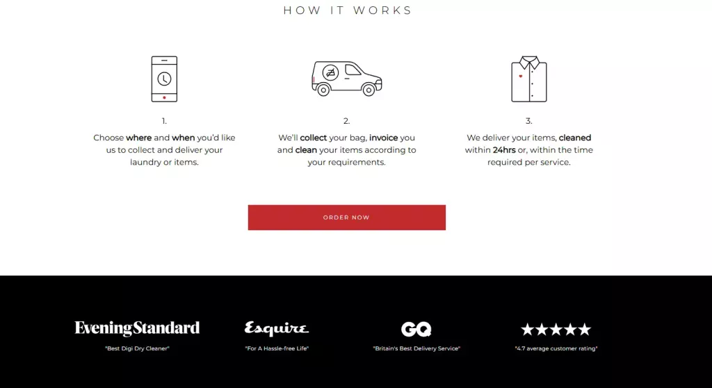
I Hate Ironing‘s landing page balances simplicity and usability. Visitors get everything they need, like pricing, service breakdown, objection handling and trust signals, in a clear, logical format that keeps the focus on converting.
Include Trust-building Elements
Trust is non-negotiable for high converting landing pages. Visitors need social proof that your product or service works to take action. Layering in trust signals throughout your landing page, such as testimonials, review stars, case studies and customer reviews, shows visitors they’re making the right choice.
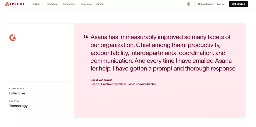
Asana uses trust-building elements throughout their work management software landing page.
- They name-drop household brands that use their tool, boosting credibility.
- They include a glowing customer testimonial that highlights how Asana has transformed workflows.
- They back it all up with hard stats from their users showing how their platform increases productivity and streamlines management.
Write Persuasively
“Ah, this is exactly what I need!”
That’s the reaction you want every visitor to have the moment they land on your page. How do you make that happen? With compelling copy that speaks directly to them.
But what makes copy compelling? It’s not just words on a page. It’s about creating an instant connection, showing your audience that you understand their challenges — and that your solution is the answer they’ve been searching for.
Compelling Header and Subheader
High converting landing pages start with a header that packs a punch. It grabs attention and speaks directly to your audience’s needs or desires.
Your subheader is the closer. It builds on the promise of the header, reinforcing the value of your offer and giving readers a reason to take the action.
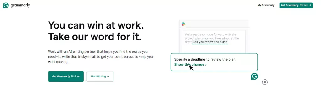
Grammarly does this well. They understand their target audience needs to communicate effectively at work — and they speak directly to this in their header. The subheader explains how their AI writing assistant helps tackle emails, delivers clear messages and keeps productivity flowing. It’s relatable and makes the benefits impossible to ignore.
Convey Benefits, Not Features
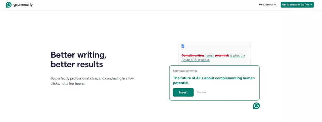
Persuasive writing isn’t about listing features or rattling off specs. People don’t buy features — they buy the solutions these features offer. By focusing on why it matters, you’ll write copy that connects and converts.
Grammarly nails this again. Instead of going on about the “advanced linguistic algorithms” of the AI writing assistant, they show you how their tool makes writing easier and stress-free at work.
Engaging Visuals
Combine compelling copy with effective visuals, and you’re on track to a high converting landing page. In fact, 80% of users are more likely to read the copy if there’s an engaging image or video alongside it. Just don’t overdo it; otherwise, you’ll distract visitors from the task at hand.
Big Bertha Original utilises video to amplify their messaging. They don’t just tell you their beanbags are comfortable — they show it with a lifestyle video. A happy family relaxing on beanbags, book in hand and a fireplace crackling in the background? Sold.
Handle Objections
Objection handling can be the secret to the success of high converting landing pages. It’s not about defending your product or service — it’s about addressing the reasons someone might hesitate to fill out your form.
- Is cost a potential concern? Highlight that there’s a free trial.
- Is credibility a worry? Show off your glowing testimonials, extensive years of experience or highly qualified team.
- Delivery troubles? Flaunt your nationwide, 24/7 delivery service.
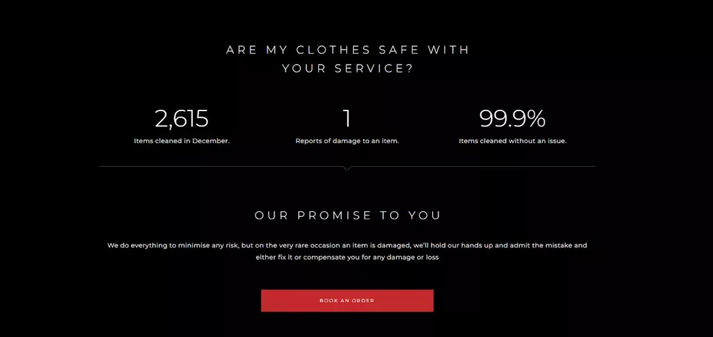
Take I Hate Ironing, for example. If you’re considering their dry cleaning service, you might worry your clothes will get damaged. They tackle this fear head-on by displaying their minimal damage report stats. They go a step further by reassuring customers that in the 0.1% chance something goes wrong, they’ll cover the cost.
Offer Incentives
Everyone loves a good deal. Offering discounts, free trials or bonuses can make your offer more appealing and give your conversion rate a boost.
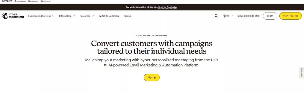
Mailchimp nails this approach with their email marketing platform landing page. Right at the top of their landing page, they spotlight their free 14-day trial. It’s a low-risk, high-reward way for potential customers to try the platform without committing upfront.
Above-the-fold Form Placement
Where you place your form matters. Keeping it above the fold, where visitors can see it without scrolling, makes it easier for them to take the next step.
But even the best-placed form won’t convert if it’s a pain to fill out. Remember to keep it clean and only ask for the essentials to avoid scaring visitors off. If all you need is a name and email, don’t overcomplicate it.
What if you need more than the basics? No matter the length, your form should always feel easy and rewarding.
Look at BetterHelp. Their onboarding form isn’t short, but they make it feel effortless by using encouraging copy, explaining why each piece of information is needed and reinforcing trust with stats about licensed therapists. It feels less like a form and more like a guided experience.
Test and Review the Data
Every winning landing page is the product of consistent testing. A/B test everything that impacts user behaviour, such as headlines, subheaders, CTAs, visuals and button colours.
Even the best-performing landing pages can be fine-tuned. Small tweaks can lead to big wins. Once you’ve tested and optimised, don’t stop there — test again, analyse the data and refine further.
Don’t Stop Your Traffic at the Door
A high converting landing page is only one piece of the puzzle. To make it work, you need a steady flow of traffic using PPC campaigns that bring qualified visitors to your page.
You also shouldn’t stop at just optimising your landing pages. You need to optimise every page of your website to increase conversion rates across the board.
If this sounds overwhelming, don’t worry. We offer a free website and marketing review so you can see where to focus your marketing efforts.
Want to learn more about creating even more effective landing pages? Watch this video:
FAQs
What is the ideal landing page conversion rate?
A great conversion rate benchmark to strive towards is 10% or above across industries.
What is the main purpose of a landing page?
The purpose of a landing page is to drive a specific action, whether that’s generating leads, making sales or increasing signups.
What must a landing page contain?
A landing page needs a compelling headline, persuasive copy, a strong CTA and trust-building elements like testimonials.
What is an optimal landing page structure?
Use a clear header, benefit-driven copy, engaging visuals and a focused CTA. Keep the layout simple and intuitive.
How do I increase my landing page conversion rate?
Focus on clarity and connection. Use a compelling headline that grabs attention, highlight the benefits (not just features) and make your CTA impossible to miss. Test everything and let the data guide your improvements.