These Mistakes KILL Conversion Rates (#290)

Let me guess — you want a big, industry-leading conversion rate on your website and landing pages.
Why? Because a higher conversion rate means more leads and sales from the same amount of website traffic you’re currently getting. And that sounds good in any economy.
So how do you get there? You stop making these subtle yet horrible conversion-blocking mistakes that prevent even good quality website visitors from becoming a lead or sale. These conversion rate mistakes aren’t always obvious. In fact, some of the world’s biggest brands are making these very mistakes on their websites right now.
But don’t let that be you.
Executive Summary
The most damaging conversion rate mistakes fall into four critical categories:
- Prioritising design over customer experience — creating visually stunning websites that fail to guide users toward conversion
- Asking for too much, too soon — demanding excessive commitment before visitors understand your value proposition
- Deploying unenticing CTAs — using generic, uninspiring calls-to-action that fail to motivate action
- Building overbearing forms — creating friction with lengthy, complicated forms that drive prospects away
Each of these conversion rate killers has straightforward solutions that can dramatically improve your website’s performance without requiring a complete redesign.
Design Over Conversion: A Beautiful Dead End
The basics of conversion rate optimisation start with a fundamental principle: anybody relevant for your business should immediately realise they’re in the right place and be given a compelling next step.
Yet one of the most common conversion rate mistakes is prioritising aesthetics over functionality.
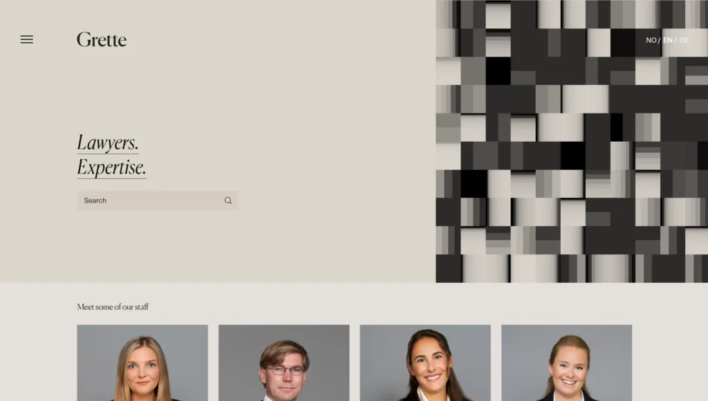
Consider this example of a Norwegian law firm website, Grette. While visually appealing with nude tones and great staff photos, it offers:
- No clear information on the homepage
- No logical next step for visitors
- Only a search bar with no instructions
- No clear contact methods or CTAs
A conversion-optimised version would include:
- A general contact form for questions
- A “find out if you have a case” assessment option
- A prominent phone number with operating hours
- Clear qualification criteria to filter quality leads
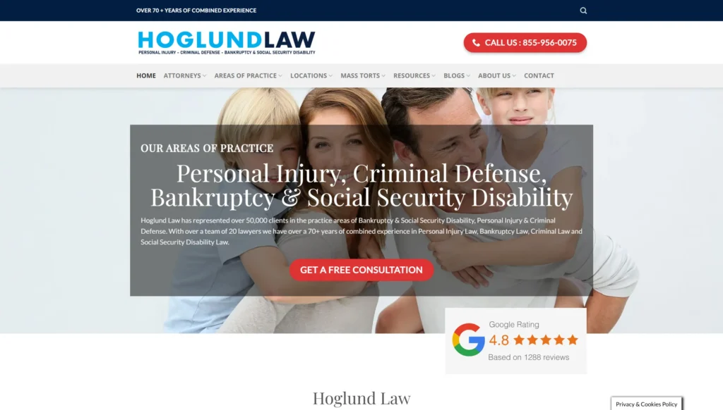
By contrast, another law firm’s website, Hoglund Law, lacks fancy design but clearly displays:
- Areas of law they serve
- Compelling next steps
- Strong credibility signals (Google reviews)
- Benefit-driven copy
The key takeaway? Your website can (and should) be visually appealing, but never at the expense of conversion fundamentals.
Asking Too Much, Too Soon: The Premature Commitment Mistake
Another major conversion rate mistake is demanding excessive commitment before visitors have had a chance to explore your offerings.
The eCommerce platform, Shein, greets visitors immediately with an intrusive pop-up demanding account creation. This creates a significant barrier because:
- Visitors haven’t yet determined if the products meet their needs
- Account creation requires substantial time investment
- The value exchange isn’t clear to new visitors

A better approach, exemplified by Lucy and Yak, is:
- Allowing visitors to browse for approximately 10 seconds
- Then offering a discount voucher in exchange for just an email address
- Creating a much lower barrier to entry

If increasing account registrations is a KPI, consider delaying the request until visitors have had time to browse and establish interest in your products. This strategic patience often results in higher overall conversion rates despite the delayed ask.
Unenticing CTAs: The Conversion Rate Contraception
Call-to-action buttons represent critical decision points for your visitors, yet many businesses sabotage their conversion rates with poor CTA choices. Here are two particularly problematic examples:
The “Get Started” Mystery Tour
Inviting people to “get started” when they don’t yet know what they’re supposed to be starting is a conversion killer. This vague phrasing creates uncertainty about:
- What the process involves
- How long it will take
- What the end result will be
The “Contact Sales” Repellent
Perhaps even worse is the “contact sales” CTA. As Tim notes in the video above, when most people think of salespeople, their associations tend to be negative. Rightly or wrongly, many associate talking to salespeople with:
- Being pressured to buy
- Spending more than intended
- Purchasing something they don’t really want
The Solution: Specific, Value-Focused CTAs
Instead of these conversion rate mistakes, create call-to-actions that:
- Describe the specific next step: “Request a Free Consultation” instead of “Contact Sales”
- Offer multiple commitment levels: HubSpot’s approach of “Get a Demo” (primary) and “Get Started Free” (secondary) accommodates different stages of buyer readiness
- Include clarification text that explains what happens after clicking
Overbearing Forms: The Conversion Rate Killer
The final major conversion rate mistake is using lengthy, complicated forms that create unnecessary friction in the conversion process.
While collecting comprehensive prospect information is valuable, many website visitors hesitate to provide extensive personal details without understanding:
- Why the information is necessary
- How it will be used
- What benefit they’ll receive in exchange
Strategic Form Design
That said, form length can be used strategically:
- For quality filtering: If you’re receiving too many low-quality leads, adding more fields can help qualify prospects. We’ve long offered a free website and marketing review which uses a detailed form to ensure requesters are serious.
- For improved user experience: Consider showing only one field at a time to make longer forms more digestible. This creates a sunk cost mentality — “I’ve already invested five minutes, so another couple of fields won’t hurt.”
- For transparency: Always explain why you’re requesting information beyond basic details, focusing on how it benefits the user. For example: “We need your location to match you with the nearest representative.”
- For reduced friction: Make non-essential fields optional, especially those requesting more personal data.
Our founder, Tim Cameron-Kitchen, recommends regular CTA audits to prevent “form bloat” — the gradual addition of unnecessary fields that nobody in your organisation actually uses.
Next Steps
To immediately improve your website’s conversion rates:
- Audit your website design: Ensure every page clearly communicates what you offer and includes compelling next steps, regardless of how beautiful the design is.
- Review your pop-up strategy: If you’re asking for information immediately, make sure the request is minimal and the value exchange is clear.
- Rewrite your CTAs: Replace generic language with specific, value-focused wording that sets clear expectations about what happens next.
- Streamline your forms: Question every field and keep only those that are absolutely necessary or strategically valuable.
- Test and measure: Implement these changes one at a time and track the impact on your conversion rates to understand which improvements deliver the biggest gains.
Remember, fixing these conversion rate mistakes doesn’t require a complete website redesign — small, strategic changes can deliver significant improvements.
In Conclusion
The most damaging conversion rate mistakes often hide in plain sight. By prioritising conversion principles alongside design aesthetics, carefully timing your information requests, crafting compelling CTAs, and streamlining your forms, you can dramatically improve your website’s performance.
These improvements don’t just increase your conversion rates — they enhance the overall user experience, build trust with potential customers, and ensure you’re making the most of every website visitor.
Implementing these changes doesn’t require a massive overhaul of your digital presence. Start by addressing the most obvious conversion rate mistakes on your highest-traffic pages, then systematically work through the rest of your site.
The result? More leads and sales from your existing traffic — a win in any economic climate.